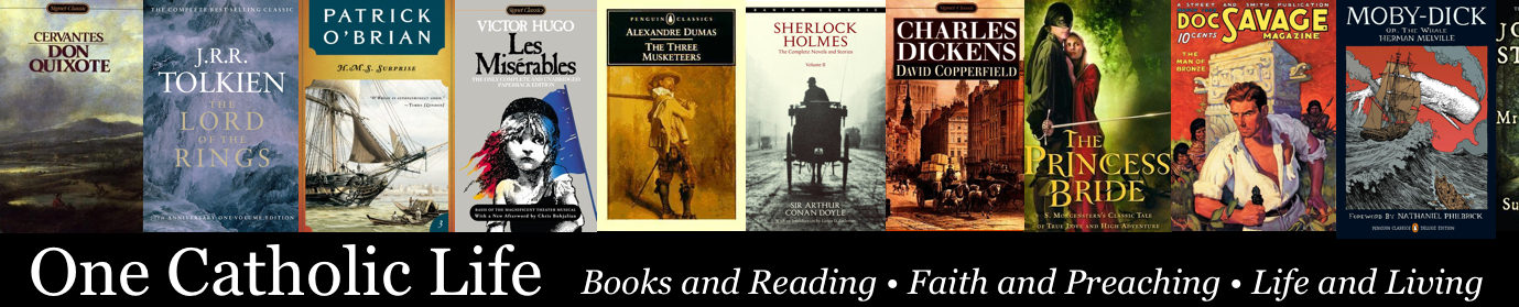
Book Covers and the Imagination
While you can’t judge a book by its cover, a beautiful cover makes a book all the more enjoyable. During the next few weeks I am going to be featuring some great book cover artists.
I don’t know about you, but when I try to picture what I’m reading, I find that the cover of a book often provides the color palette that my imagination uses to form the pictures. For instance, I have a very hard time reading science fiction paperbacks from the 1960s with those washed-out, almost abstract cover images. It’s like watching a grainy, dirty film. I almost always try to find a reprint with more bold colors.
When I first tried reading Foundation by Isaac Asimov, I just couldn’t get into it–it seemed so dingy. But when I came across a newer edition of the book with a brighter cover I gave it another try and I ended up loving it.

Foundation and Empire, 1960s, The Foundation Trilogy, 1980s
Does this happen to anyone else, or is it just me?
Sometimes it bothers me to think that a book cover has that much sway over my reaction to a book, but I’ve always had difficulty in picturing things in my mind. I would make a horrible interior decorator. Over the years I’ve gotten better at ignoring “bad” book covers, but it takes quite a bit of mental effort. That’s why cover artists are so important to me.
I’ll begin tomorrow with one of the acknowledged masters of cover art, Michael Whelan. Who else would you like to see featured? Leave a comment and let me know.